Teaching Aids - What Did Students Watch?
In this section:
Overview
The teaching aids can help you understand student behavior.
Overview on Views and EchoCenter Analytics
For an overview of how EchoCenter Analytics are calculated and displayed, please visit: Overview of Views and EchoCenter Analytics
Course Statistics
The course statistics show you views by Echo and by week.
How Do I Use Course Statistics?
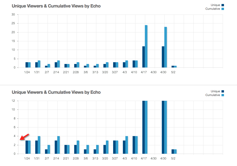
Select the View Trends By Echo option in the drop-down list to see how many times an Echo was viewed and the number of unique viewers. In the bar graph below, we see that the Echoes of April 17 (4/17) and April 30 (4/30) had far more viewers than typical. There may be discussion questions in these Echoes that are worth reviewing.

Select the View Trends By Week option in the drop-down list to see how many Echoes were viewed by week and the number of unique viewers. You will probably see an upsurge in viewing the week before an exam.
Several features let you see details and adjust the graph:
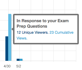
- See details. Hover over a bar to see a pop-up with details about the number of views, as shown below
- Focus on a particular part of the graph. Click one part of the graph and drag to zoom, revealing detail. Double-click to restore the normal view. The screenshot below shows the graph at the normal zoom level, then zoomed in to show detail. Notice how the vertical axis of the zoomed graph is more granular, helping you to perceive details.
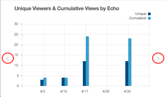
- See earlier and later dates. Click the arrows on the left or right side of the graph to scroll the area displayed.
What Counts as a "View" When Compiling Course Statistics?
You may notice a discrepancy between what your students tell you and what the course statistics tell you. An entire class (of, say, 250 students) may claim to have viewed an Echo. Yet the course statistics may show many fewer views. What accounts for the discrepancy?
- When a student plays the Echo using the EchoPlayer, the view is counted when course statistics are compiled.
- When a student downloads the Echo instead of using the EchoPlayer, the view is not counted when course statistics are compiled.
- When a student views an Echo on a mobile device, the view is not counted when course statistics are compiled.
Viewing Analytics
Viewing analytics present quantitative data for a particular Echo.
Average Completion helps you gauge the level of student viewing of this Echo relative to other Echoes. Say that student A watches the entire Echo (every scene), generating a completion rate of 100%. Student B watches only half of the scenes, generating a completion rate of 50%. If no other students watch the Echo, the Average Completion is 75%. You might want to watch this parameter during the term, querying if the completion rate for a particular Echo is very high or very low.
- Select the Echo you want to analyze.
- Click the Analytics tab.

How is average viewing completed calculated?
Our analytics service (known as HEMS) divides a recording into segments for analytic purposes and keeps track of how many times users cross segment boundaries. To calculate average viewing completion, HEMS returns the total number of segments viewed divided by the number of cumulative views per recording. The EchoCenter uses that number to calculate the % viewed based on the total number of segments per presentation.
Engagement Analytics
Engagement analytics give you a quantitative view of student interest in a particular Echo. This is different from the student usage reports, which show a particular student's engagement in the course.
- Select the Echo you want to analyze.
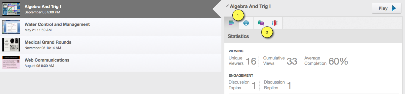
- Click the Analytics tab (marked "1" in the figure below) to display viewing and engagement analytics.
- In this example, the Echo generated one discussion topic with one reply. Discussions do not always show this one to one correspondence. You could have, for example, four topics and six replies. The replies can be distributed among the topics or one topic can generate all of the replies.
Click the Discussions tab (marked "2" in the figure below) to display the discussions.
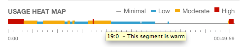
Usage Heat Maps
Heat maps illustrate student reaction to an Echo. A color-coded line shows what segments of an Echo students found:
- Most interesting ("hot spots")
- Somewhat interesting ("warm spots")
- Less interesting
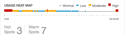
Text below the map calls out the number of hot and warm spots.
Clicking on the heat map opens the Echo to that segment.
When you hover your cursor over parts of the heat map line, a yellow tooltip:
- Indicates the segment in the Echo. In the example below, the cursor is over minute 19, second 0 of the Echo.
- Interprets the color. In the example below, the cursor is over an orange portion of the heat map so the tooltip indicates that the segment is "warm".
The EchoCenter determines the "heat quotient" of a segment by analyzing:
- The number of views received by a segment
- The number and intensity of discussions generated by a segment
- The number of notes generated by a segment